Why Bad UI Design Is Ruining Everything (And How to Fix It)
Ever rage-quit an app because the interface made no sense? You’re not alone. Bad UI design is an epidemic, turning what should be seamless digital experiences into frustrating puzzles. According to research, 88% of users won’t return to a website after a bad experience. That’s right—one misstep in usability, and you’ve lost a user forever.
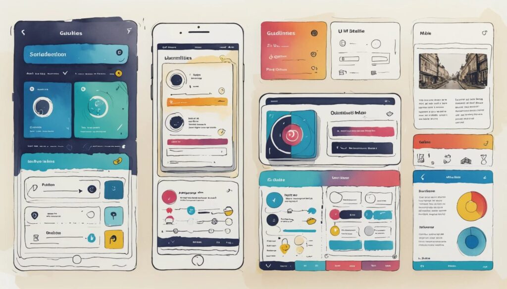
The good news? There’s a cure: well-established user interface design guidelines. Specifically, the Nielsen and Molich heuristics, which serve as the golden rules for improving interface usability. These usability principles ensure that digital products are intuitive, efficient, and, most importantly, not rage-inducing.
The 10 UI Design Guidelines You Can’t Afford to Ignore
- Visibility of system status: Keep users informed about what’s happening.
- Match between system and the real world: Use familiar language and concepts.
- User control and freedom: Give users an “undo” button—because mistakes happen.
- Consistency and standards: Stop making users relearn basic functions.
- Error prevention: Design interfaces that help users avoid mistakes.
- Recognition rather than recall: Help users by providing visual cues.
- Flexibility and efficiency of use: Cater to both beginners and experts.
- Aesthetic and minimalist design: Less clutter, more clarity.
- Help users recognize, diagnose, and recover from errors: Offer meaningful error messages.
- Help and documentation: Make support easy to find.
Keep Users in the Loop with Visibility of System Status
- Users should always know what’s happening within the interface.
- Loading indicators, progress bars, and confirmations build user confidence.
- Lack of feedback leads to confusion and frustration.
Imagine ordering a ride on a rideshare app, but after tapping “Confirm Ride,” nothing happens. Did it work? Should you book another? Will you soon be surrounded by five drivers, all demanding payment? A simple progress indicator eliminates this panic. Whether it’s a spinning wheel, a status update, or a friendly “Your driver is on the way!” message, users need reassurance that the system is working.
Speak the User’s Language with Real-World Concepts
- Interfaces should use familiar metaphors and language.
- Icons and labels should reflect real-world objects and concepts.
- Technical jargon alienates users.
Ever seen an error message that reads, “Exception 0xC0000005 at memory address 0x00410F3B”? Of course not—because no sane UI designer would write that. Instead, interfaces need to mimic real-world interactions. Consider the Adobe Photoshop “trash can” icon for deleting files—it’s intuitive because we all know what a trash can does.
User Control and Freedom: Give Users an Exit Strategy
- Users make mistakes—give them a way to undo actions.
- Confirmations help prevent irreversible errors.
- Navigation should always allow for easy backtracking.
Ever deleted an important email and immediately regretted it? Thankfully, Gmail’s “Undo” button has saved countless users from disaster. Without this safety net, users would be left screaming into the void. Every interface should offer a way to reverse unintended actions, whether it’s an undo button, a cancel option, or a simple back function.
Consistency and Standards: Stop Confusing Users
- Common actions should work the same way across platforms.
- Users rely on familiarity—don’t reinvent basic functions.
- Inconsistent design leads to frustration and abandonment.
Imagine if one app used “Ctrl + S” to save while another used “Ctrl + Q” (which typically quits). Chaos. Users expect consistency. If a button looks like a play button, it should play media—not open a settings menu. Stick to industry standards and avoid unnecessary surprises.
Error Prevention: Because No One Reads Error Messages
- Prevent mistakes instead of forcing users to fix them.
- Helpful prompts and autocomplete features reduce errors.
- Good design anticipates user behavior.
Ever typed your password incorrectly and received a vague “Invalid input” error? Instead, a well-designed system might say, “Your password must be at least 8 characters with one number.” Good UI design prevents errors before they happen—whether through smart suggestions, clear instructions, or safeguards like confirmation pop-ups.
Recognition Rather than Recall: Make Actions Obvious
- Users recognize visual cues faster than they recall information.
- Icons, previews, and tooltips aid navigation.
- Minimal reliance on memory improves usability.
Think about how Google shows search suggestions as you type. Instead of forcing users to remember exact phrases, it offers helpful prompts. Similarly, dropdown menus and icons reduce cognitive load, making interfaces easier to navigate.
Flexibility and Efficiency: Design for Everyone
- New users need guidance, but power users need shortcuts.
- Customizable settings improve user efficiency.
- Keyboard shortcuts enhance productivity.
Great UI adapts to different user skill levels. Take Photoshop: beginners can use menus, while pros rely on keyboard shortcuts and macros. This balance ensures that both casual and expert users get the best experience.
Minimalist Design: Get Rid of the Clutter
- Every element should serve a purpose.
- Unnecessary details distract and overwhelm users.
- Simplicity improves readability and navigation.
A cluttered interface is like a messy desk—you can’t find anything. Google’s homepage is the perfect example of minimalism: one search bar, a few buttons, and nothing else. The cleaner the UI, the easier it is to use.
Helping Users Recover from Errors
- Errors should be explained in plain language.
- Solutions should be provided alongside error messages.
- Users should always have a way to correct mistakes.
Instead of a vague “Error 404,” a better message would be, “Page not found. Try searching for what you need or return to the homepage.” A well-designed UI doesn’t just point out errors—it helps users fix them.
Help and Documentation: A Lifeline for Confused Users
- Support should be easy to find and understand.
- Tooltips and FAQs improve user self-sufficiency.
- Good documentation prevents frustration.
No one enjoys reading manuals, but when users need help, make it easy to find. Well-placed tooltips, interactive tutorials, and FAQs empower users to troubleshoot issues without calling tech support.
Crafting Interfaces That Users Actually Enjoy
At the end of the day, great UI design isn’t about making things pretty—it’s about making things usable. By following these user interface design guidelines, you’ll not only create more intuitive experiences but also increase user retention and satisfaction.
So, the next time you’re designing user experiences, ask yourself: Would this frustrate me? If the answer is yes, fix it—before your users abandon ship.