Choosing the Best Fonts for Websites: A Comprehensive Guide
When building a website, every design decision you make matters – perhaps none more so than selecting the right font. Typography can convey emotion, enhance readability, or even create a lasting memory of your brand. Don’t believe me? According to a study by MIT, the fonts on your site can affect user trust and overall user experience. With so many options out there, how do you know you’re choosing the best fonts for websites?
We’ll take a deep dive into a wide variety of font styles, offer tips for choosing fonts, and show you how to pick the readable fonts for web that not only look modern but also ensure a seamless user experience across all devices.
Below, we’ll cover the differences between serif, sans serif, and script fonts, and show you how to increase the readability and emotional impact of your website’s typography. Whether you’re looking for sleek, modern serif fonts or minimalist sans serif typography, we’ve got you covered.
Understanding the Main Types of Website Fonts
- The difference between serif, sans-serif, and script fonts
- How modern serif fonts and sans serif typography style impact readability
- Choosing between font types for different website purposes
The world of typography can be vast, but when it comes to website design, we tend to classify web fonts into three main families: serif, sans serif, and script. Each of these font types brings a unique touch and subtly influences how users perceive your brand through typeface variation.
1. Serif Fonts
Serif fonts are named after the small lines or “strokes” attached at the ends of the letter edges. Traditionally, they evoke a sense of elegance and class. They’re associated with printed newspapers and books. Modern serif fonts like Times New Roman, Playfair Display, or Georgia, still maintain this old-world elegance, but can also comfortably adapt to digital formats.
These modern serif fonts are best suited for websites that cater to more traditional or professional brands. Financial institutions, law firms, and editorial platforms often rely on strong serif typefaces to communicate authority and craftsmanship.
2. Sans Serif Fonts
Sans serif typography is, in many ways, the opposite of serif fonts. “Sans” literally means “without,” hence these fonts have no additional strokes at the edges of the letters. This simplicity gives sans serif fonts a modern, clean, and sometimes even futuristic feel.
Popular examples include Helvetica, Arial, and Lato. A staple of web design, sans serif fonts are often considered some of the most readable fonts for web. Their crisp, uncluttered appearance ensures that users can easily process information – making them great for paragraph text or minimalistic website designs.
3. Script Fonts
Script fonts, which borrow heavily from handwriting styles, are usually more decorative and stylized. They can add personality, elegance, or a touch of whimsy to your website. However, script fonts are not always ideal for body text, as their intricate curls and swirls may hinder readability.
Reserve script fonts for headers, logos, quotations, or other elements that need to stand out in isolation. The decorative nature of script fonts can make them ideal choices in areas that don’t demand prolonged reading.
What Makes a Font Readable?
- How readability affects user experience
- Tips to increase font legibility on different devices and browsers
- Recognizing when font size and contrast hit the sweet spot
No one enjoys squinting at their screen, trying to decipher fancy typography. If your website’s visitors experience this, they will most likely click away. This is why focusing on readable fonts for web is paramount.
Legibility boils down to clarity and ease of reading, even over large bodies of text. Here are three factors to consider:
- Size: Avoid font sizes that are too small. A general guideline for body text is to stay between 16-21px for optimal readability on the web.
- Contrast: Keep a high contrast between your text and background color. Dark text on a light background is typically easier to read.
- Font Weight and Line Spacing: Using bold fonts sparingly helps draw users’ attention to the right areas, while generous line spacing (1.5 or more) improves the paragraph flow, making it easier for users to scan text information.
Great readable font options include Arial, Helvetica, Georgia, and Lato, as they provide clear, simplistic design while looking professional and approachable across different types of screens.
Tips for Choosing Fonts for Your Website
- Ensure text fits your brand voice and design theme
- Use complementary fonts for titles, body, and accents
- Optimize for website speed
- Account for web accessibility features
With thousands of choices out there, selecting the most suitable font may seem daunting. However, by focusing on specific cues, you can streamline your font selection process:
1. Stay True to Your Brand Identity
Fonts do more than just communicate text; they also tell a story through their shape, style, and presentation. For instance, Barlow, a minimalist sans-serif font inspired by Californian street signs, exudes a calm and approachable vibe. On the other hand, the intricacy of a display serif font like Publico might evoke a sense of intellect and professionalism.
You’ll need to choose fonts that evoke the emotions you want your product or service to carry. Is your brand luxurious and sophisticated? Modern serif fonts will resonate well. Does your product represent the future of technology? Opt for some sleek sans serif typography. Make sure all elements work together to create a cohesive and impactful statement.
2. Pair Fonts Thoughtfully
For a polished, professional design, it’s critical to avoid overwhelming your users with too many fonts. As a general rule, limit your combination to a maximum of two or three fonts. You can try pairing complementary fonts, like a serif for your headings and a sans serif for the body text.
Consider this common pairing structure:
| Font Purpose | Recommended Fonts |
|---|---|
| Heading/Title Font | Playfair Display, Abolition (Bold) |
| Body Text | Lato, Open Sans, or Arial |
| Accent Font | Sofia Pro, Scriptina for call-to-action buttons |
3. Optimize for Website Speed & Performance
Fonts heavily influence how quickly your site loads. While it’s tempting to go wild with custom fonts, remember that each additional font file requires extra resources from your visitors’ browsers. In some cases, loading too many fonts may reduce your website speed.
Whenever possible, use web-safe fonts such as Arial, Times New Roman, or Palatino, which won’t require additional download time from your users. If you opt to use web fonts (such as Google Fonts), consider leveraging compressions to reduce server load.
4. Ensure Accessibility
About 61 million Americans live with some form of disability, making web accessibility key when designing a site. If your website isn’t readable by everyone, it doesn’t matter how beautiful your design is.
Some methods to ensure accessibility include:
- Choose clear fonts with distinct, non-overlapping letters (sans serif fonts like Open Sans or Roboto are excellent here).
- Implement strong color contrasts between background and text.
- Be mindful of dynamic font re-sizing for visually impaired individuals or people with poor vision.
Popular Fonts for Your Website
Let’s stir up some inspiration. Here are some of the best fonts for websites that combine both style and function:
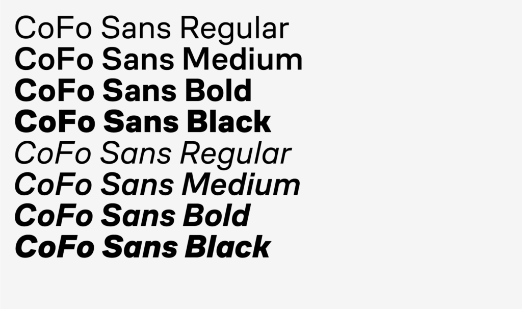
- CoFo Sans: Minimal and clean but designed to be highly readable on any digital platform.
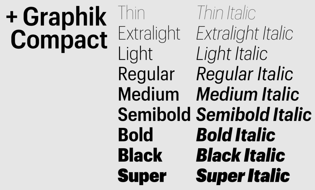
- Graphik: With over 18 styles, it’s flexible enough for professional or creative briefs alike.
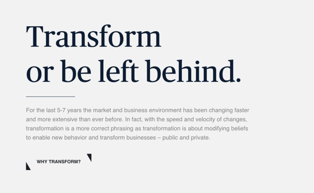
- Publico: This serif font creates a newspaper feel, lending your website a stylish yet traditional vibe.
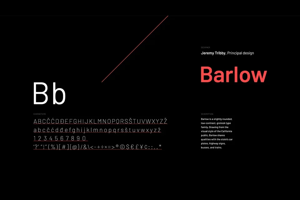
- Barlow: Perfect for a modern, urban-tinged website design. Clean and perfect for body text.
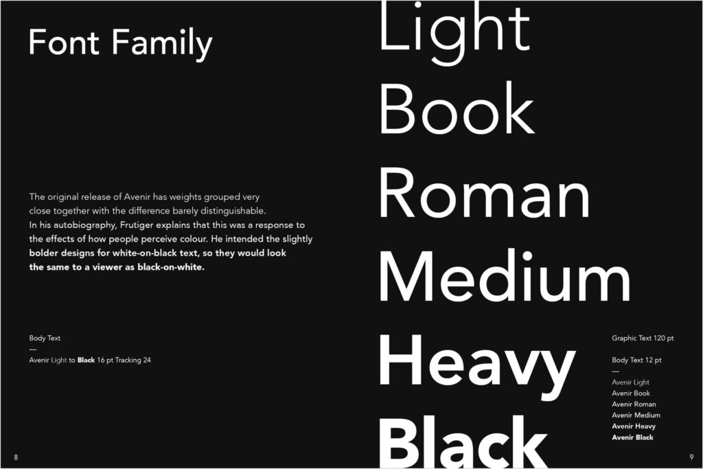
- Avenir: Known for its geometric, evenly balanced letters, Avenir is highly versatile.
Conclusion
The world of typography offers an overwhelming array of choices, but once you understand how to incorporate modern serif fonts and slick sans serif typography into your design, it becomes easier to select the best fonts for websites that are not only beautiful but also highly readable and functional.
Stick to a rule of thumb: stay true to your brand voice, ensure readable fonts for web, and always test your font choices on various devices for performance. Now that you’re equipped with tips for choosing fonts, it’s time to experiment with freely available fonts or premium collections to craft a website that stands out!
