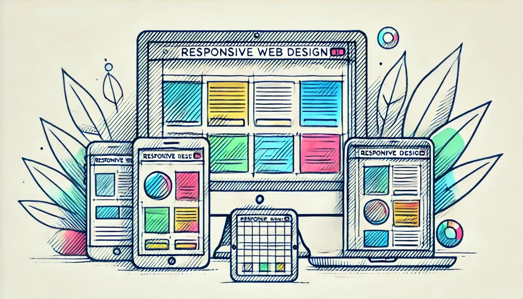
Why Responsive Web Design is Essential for Modern Websites
Did you know that 58.99% of all web traffic comes from mobile devices? That’s a staggering number! No wonder responsive web design has become a critical part of modern websites. With the immense variety of devices people use – from tiny 4-inch smartphones to expansive 27-inch desktop monitors – creating a consistent user experience is no longer optional; it’s essential. Responsive design isn’t just about squishing content to fit different screen sizes; it’s about providing an optimal experience for users no matter where or how they access your site!
In this article, we’ll dive into essential responsive web design tips, the benefits of responsive design, how to choose the right responsive design frameworks, consider the importance of user experience in responsive design, and explore some practical responsive web design techniques to ensure your site works flawlessly across all devices.
Responsive Web Design Tips: Building a Flexible Foundation
- Start with a Mobile-First Approach
- Don’t Overload Your Users with Excessive Media
- Utilize Flexible Grids and Layouts
- Ensure Readability with Scalable Typography
The core of any strong responsive design starts with understanding that mobile users dominate the web. A mobile-first approach means you prioritize the most limited environment (small screens) and then scale up to tablets, laptops, and desktops. This approach ensures no essential content gets lost on mobile screens.
Another significant point is media usage. High-resolution images and videos can bog down load times, especially on slower mobile connections. Take care to optimize and compress your visual elements or consider hiding certain media for smaller screens entirely.
Flexible grids are essential in responsive web design techniques. They allow you to create a structure that adapts seamlessly to various screen sizes. Pair this with scalable typography to maintain legibility no matter the device, and you’re well on your way to a user-friendly experience. A quick tip? Use percentages for widths and EM units for type sizes to ensure proper scaling throughout your design!
The Benefits of Responsive Design: Why it Matters
- Improved User Experience (UX)
- Unified Codebase Makes Maintenance Easier
- Boost in SEO Rankings
- Adaptability to Future Devices
The benefits of responsive design are numerous. Let’s start with the big one: improved user experience in responsive design. A design that adapts smoothly to various devices provides a seamless and frustration-free experience for users. Whether they’re browsing on a tablet at home or using their phone on the go, users expect your site to load quickly and be easy to navigate on any screen size.
Another benefit is the simplicity of managing a single codebase. Instead of maintaining separate desktop, tablet, and mobile sites, everything can work under the same roof. This not only makes maintenance simpler but also paves the way for faster future updates.
Responsive design also helps improve search engine optimization (SEO). Google favors mobile-friendly websites. If your site works well on mobile devices, it’s more likely to rank higher in search results, bringing in that sweet organic traffic!
And let’s not forget future-proofing. With new device sizes being introduced all the time, responsive design ensures that your site won’t become obsolete. It can adapt automatically to support new devices and their different screen sizes, providing longevity to your website investment.
Responsive Design Frameworks: Choosing the Right Tools
- Bootstrap: The Industry Favorite
- Foundation: Flexibility and Customization
- Materialize: Google’s Material Design Integration
Building a fully responsive site from scratch can be daunting, especially when navigating the intricacies of creating layouts that adapt beautifully to all devices. This is where responsive design frameworks come into play! These frameworks give developers pre-built structures to accelerate the development process without sacrificing quality.
Bootstrap is undeniably the most popular framework for responsive web design. It’s packed with customizable components and a grid system that makes it a fantastic starting point for any project. Whether you’re just starting web development or you’re a seasoned pro, Bootstrap’s low learning curve makes it the go-to choice for many.
If customization is more your speed, Foundation is another stellar option. It provides a flexible grid system and a wide array of built-in components while also allowing you more control in building out custom features to suit your needs.
Finally, Materialize offers a framework tuned to Google’s Material Design principles. It’s a visually appealing choice if you’re looking to integrate Google’s familiar UI patterns and design elements.
User Experience in Responsive Design: Prioritizing User Needs
- Content Prioritization in Different Viewports
- Maintaining Fast Load Times
- Accessibility Considerations
User experience in responsive design goes beyond just making sure your site fits on different screens. It’s about ensuring that users can easily interact with your page no matter the device. Content prioritization is key to this. Small screens simply can’t display as much information as large desktop monitors, so deciding which elements get prime real estate is crucial. Test layouts to ensure that relevant content stays visible and avoids hiding behind endless scrolling.
Load time is another critical factor in mobile user experience. Since your responsive design serves the same code across all devices, it’s important to optimize resources. No one wants to wait forever for a page to load, especially with today’s short attention spans. Focus on compressing images, cutting excessive JavaScript, and minifying CSS to maximize speed.
Don’t forget about accessibility! Ensuring your site is usable for everyone, including those with disabilities, is essential. This could be as simple as designing with larger tap targets for mobile users or ensuring screen reader compatibility. Not only does this broaden your audience, but it also has SEO benefits, as search engines favor accessible sites.
Responsive Web Design Techniques: Practical Practices for Success
- Media Queries for Customizing Styles
- Mobile Navigation: Simplicity is Key
- Flexible Images and Videos
Now let’s talk about some responsive web design techniques that help elevate your project. Media queries are a must-have for defining breakpoints and controlling how layouts change across different screen sizes. With CSS media queries, you can create different layouts for mobile, tablet, and desktop, all within the same stylesheet. It’s like having a personal stylist, curating the perfect outfit for every occasion!
Next up, navigation should be simple and user-friendly. You don’t want to overwhelm smaller screens with massive menus. Implementing hamburger menus and dropdowns can help create a clean, uncluttered interface for smartphones and tablets.
Lastly, working with flexible images and videos is key to ensuring that your content resizes automatically while maintaining the correct aspect ratios. You could use CSS ‘max-width’ properties, skip large background images, or lazy-load media to improve performance on slow connections without sacrificing visual appeal.
Conclusion
In today’s multi-device world, using responsive web design is non-negotiable. From crafting a sleek, user experience in responsive design to reaping the benefits of responsive design like simplified site management and improved SEO, there’s no shortage of reasons to dive into this approach. Whether you’re going it alone or using a trusted responsive design framework like Bootstrap or Foundation, achieving responsive success hinges on thoughtful planning, testing, and employing the right responsive web design techniques.
Remember – great designs deliver great experiences, and responsive designs ensure every user, regardless of their device, enjoys that experience. Time to take a look at your site and make sure it’s up to today’s responsive standards!