Winning at Homepage Design: 5 Key Principles for Success
Did you know that it takes users only 50 milliseconds to form an impression of your website? That’s right—before they’ve had time to blink, visitors have already judged whether your homepage is worth their time or if they should flee faster than a cat avoiding a bath. That’s why effective homepage design isn’t just a luxury; it’s a necessity.
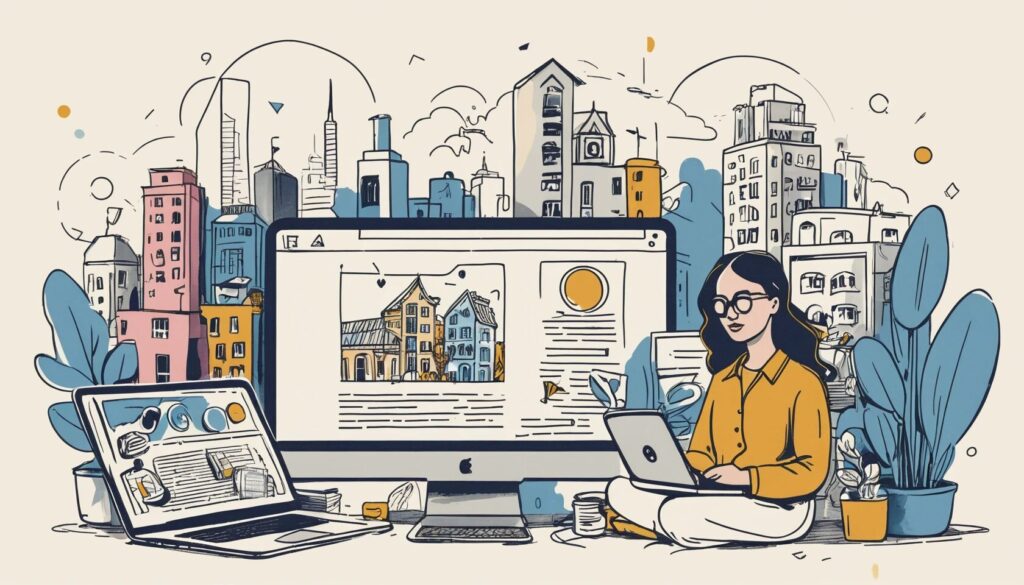
Your homepage isn’t just a digital welcome mat—it’s the deciding factor in whether users stay or leave. A well-crafted homepage enhances user experience on the homepage, making navigation intuitive while reinforcing your brand identity. On the flip side, a cluttered or confusing design will leave visitors frustrated, increasing bounce rates and killing conversions. To help you avoid this digital disaster, here are five fundamental homepage design principles that will ensure your website is both functional and visually compelling.
1. Make Navigation So Simple Even a Goldfish Could Use It
- Ensure your navigation menu is clear, concise, and easy to find.
- Use a logical layout with recognizable labels.
- Always provide a visible and clickable link back to the homepage.
Let’s be honest—most users have the attention span of a goldfish. If they have to spend more than a few seconds figuring out how to get around your site, they’re gone. Simplifying website navigation ensures visitors can find what they need without frustration.
Your navigation menu should be impossible to miss—ideally placed at the top of the page and featuring clear, straightforward labels. Ditch the cryptic jargon; users shouldn’t have to solve a riddle just to find your contact page.
Furthermore, always provide an easy way for users to return to the homepage. A clickable logo in the top-left corner is the industry standard—don’t reinvent the wheel here. The goal is to create a seamless experience that encourages users to explore, not escape.
2. Communicate Your Purpose Before Users Have Time to Blink
- Make your brand name and logo highly visible.
- Use a clear, benefit-driven headline that explains what you do.
- Include a brief but compelling value proposition.
Visitors shouldn’t have to play detective to figure out what your website is about. If your homepage doesn’t instantly communicate who you are and what you offer, users will bounce faster than a rubber ball on concrete.
Your brand name and logo should be prominently displayed—preferably in the top-left corner—because that’s where users instinctively look first. Follow this with a strong, benefit-driven headline. Instead of a lifeless “Welcome to Our Website,” try something like, “Helping Businesses Build Stunning Websites in Minutes”. Now that’s a statement that grabs attention.
Finally, reinforce your purpose with a compelling value proposition. What sets you apart from competitors? Why should users care? If your homepage can’t answer these questions in seconds, it’s time for a redesign.
3. Showcase Your Best Content Without Making Users Dig
- Feature your most important offerings or content above the fold.
- Highlight key products, services, or blog posts with engaging visuals.
- Avoid clutter—prioritize quality over quantity.
Your homepage should act as a digital storefront, enticing users to dive deeper. But if your best content is buried under layers of unnecessary clutter, most visitors will never find it.
Keep crucial information above the fold—the part of the screen users see without scrolling. Showcase top-selling products, featured services, or must-read blog posts in a visually appealing way. Instead of vague labels like “Products” or “Services,” use engaging descriptions like “Our Best-Selling Coffee Blends” or “Award-Winning Marketing Tools.”
That said, resist the urge to overload your homepage with excessive elements. Too much content creates decision paralysis, overwhelming users instead of guiding them. Prioritize the essentials and let visitors explore at their own pace.
4. Guide Visitors Toward Action Without Being Pushy
- Use clear and compelling calls to action (CTAs).
- Ensure primary actions are visually distinct and easy to locate.
- Design with a strong visual hierarchy to direct user attention.
A beautiful homepage is useless if it doesn’t drive action. Whether you want users to sign up, make a purchase, or contact your team, your calls to action (CTAs) should be impossible to overlook.
Avoid vague labels like “Click Here” or “Learn More.” Instead, use persuasive, benefit-driven text: “Start Your Free Trial” or “Explore Our Best Deals”. These phrases create a sense of urgency and tell users what they’ll gain by clicking.
Additionally, ensure your CTAs stand out visually. Use bold colors, contrasting buttons, and strategic placement to make them pop. When everything on your homepage competes for attention, nothing stands out—so establish a clear visual hierarchy that naturally directs users toward key actions.
5. Prioritize Accessibility and Keep Distractions to a Minimum
- Follow website accessibility best practices for an inclusive experience.
- Minimize intrusive elements like autoplay videos and excessive pop-ups.
- Stick to clean, familiar layouts that users intuitively understand.
An effective homepage design isn’t just about aesthetics—it’s about usability. If your site isn’t accessible to all users, you’re alienating a significant portion of your audience.
Follow website accessibility best practices by ensuring proper color contrast, readable fonts, and keyboard navigation support. Use alt text for images so visually impaired users can understand your content through screen readers.
Equally important is eliminating unnecessary distractions. Autoplay videos? More annoying than helpful. Excessive animations? They slow down your site and frustrate users. And don’t even get us started on intrusive pop-ups—unless you want visitors closing your tab faster than they opened it.
Finally, stick with intuitive layouts. While creativity is great, usability should always come first. Users are accustomed to certain patterns—top navigation bars, clear headings, and predictable structures—so don’t reinvent the wheel unless you have a very good reason.
Your Homepage Sets the Tone—Make It Count
Your homepage is your website’s first impression, and in the digital world, first impressions are everything. A cluttered, confusing homepage will drive visitors away, while a clean, intuitive design will keep them engaged and coming back for more.
By focusing on these five principles—simplifying website navigation, clearly communicating your purpose, showcasing key content, guiding visitors toward action, and following website accessibility best practices—you’ll create a homepage that not only looks great but also delivers a seamless user experience.
Now, take a step back and assess your own homepage. Is it intuitive? Clear? Engaging? If not, it may be time for a redesign. After all, in a world where attention spans are shrinking, you can’t afford to make visitors work just to stay on your site.