Why Color Psychology is the Secret Weapon of UI Design
Picture this: You’re on a website, and something feels… off. The colors clash, the buttons are barely visible, and the overall vibe screams “1999 called, it wants its UI back.” That’s the power of color psychology—when done right, it’s invisible; when done wrong, it’s a disaster.
Colors aren’t just for aesthetics; they influence emotions, behavior, and even decisions. In fact, 85% of consumers admit that color is the primary reason they buy a product. So, if you’re in the business of UI design, branding, or emotional marketing, understanding color psychology isn’t optional—it’s mandatory.
How Colors Influence User Behavior and Brand Perception
- Colors trigger emotions and subconscious associations.
- Brands strategically use colors to shape customer perception.
- UI designers can enhance user experience through intentional color choices.
Ever wonder why social media platforms love blue? That’s because blue exudes trust, calmness, and stability—qualities that make users feel safe while over-sharing their vacation photos. Meanwhile, tech startups often go for sleek black and white palettes to appear modern and sophisticated.
Color psychology is a silent influencer, subtly guiding users toward specific actions. Want users to click that “Buy Now” button? Make it red or orange—colors that create urgency. Need to gain customer trust? Stick with blues and greens. The right color choices can mean the difference between a thriving UI and one that sends users running for the “X” button.
Decoding the Color Psychology Chart
- Each color has a unique psychological effect.
- Color choices can make or break a brand’s identity.
- A well-balanced color scheme enhances usability and engagement.
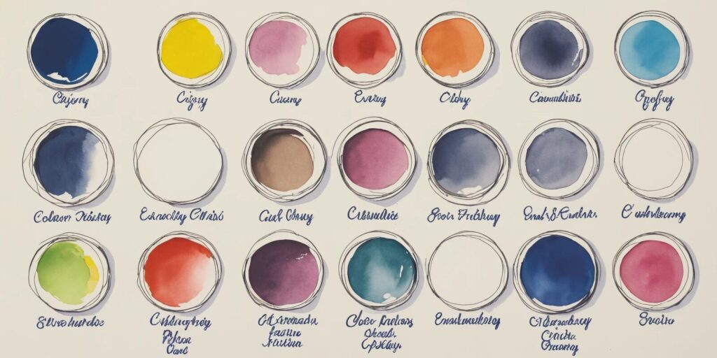
If picking colors for UI design feels like throwing darts blindfolded, a color psychology chart is your best friend. It breaks down how different colors influence emotions and perceptions. Here’s a quick cheat sheet:
| Color | Psychological Effect |
|---|---|
| Red | Passion, energy, urgency |
| Blue | Trust, calmness, reliability |
| Green | Health, growth, tranquility |
| Yellow | Optimism, warmth, happiness |
| Black | Luxury, power, sophistication |
Understanding these associations helps designers create UI elements that resonate with users on a subconscious level. Want to build trust? Go blue. Need to convey luxury? Black is your best bet. And if you’re designing a horror movie website, well, go wild with dark reds and eerie purples.
How Leading Brands Master Branding with Colors
- Successful brands use color as a strategic tool.
- Color consistency strengthens brand recognition.
- Emotional marketing relies heavily on color choices.
Big brands don’t pick colors randomly; they use them to craft specific emotional connections. Let’s break down a few heavyweights:
Coca-Cola: That unmistakable red isn’t just for show—it’s designed to evoke excitement, passion, and energy. No wonder their ads are always full of smiling people having the time of their lives.
Facebook: Blue wasn’t chosen because Mark Zuckerberg likes it; it’s a calculated move to convey reliability and security. Perfect for keeping users scrolling for hours.
Whole Foods: Their lush green branding screams health, nature, and organic goodness—exactly what they want their customers to associate with their products.
These brands don’t just use color—they own it. Their logos, packaging, and advertising are instantly recognizable, proving that strategic color usage is a branding powerhouse.
UI Design Tips: Using Color Psychology for Maximum Impact
- Choose colors that align with your brand identity.
- Maintain contrast for readability and usability.
- Use color strategically to guide user behavior.
Picking colors for a UI design isn’t about aesthetics alone—it’s about functionality. Here are some practical tips:
Make sure your colors match your brand. A meditation app using bright red? Bad idea. An adventure game in soft pastels? Probably not the best fit.
Contrast is everything. Light gray text on a white background? Instant headache. High contrast ensures readability and accessibility, making the user experience smooth.
Use color to nudge users in the right direction. Call-to-action buttons should stand out, and important information should be highlighted. If a button blends into the background, say goodbye to conversions.
Building a Cohesive Color Palette for Your Brand
- Define the emotions you want your brand to evoke.
- Select primary and secondary colors for consistency.
- Ensure uniformity across all branding materials.
Creating a color palette isn’t about randomly picking shades that “look nice.” It’s about crafting a visual identity that speaks volumes. Here’s how:
Step 1: Define your brand’s personality. Is it bold and energetic? Cool and sophisticated? The colors you choose should reflect that.
Step 2: Choose a primary color. This is your brand’s signature hue. It should dominate your website, logo, and marketing materials.
Step 3: Pick complementary colors. These should enhance your primary color without overpowering it. Tools like Adobe Color can help you find the perfect combinations.
Step 4: Stay consistent. Whether it’s your website, social media, or product packaging, your colors should remain uniform. Consistency builds brand recognition and trust.
Final Thoughts
Color isn’t just decoration—it’s a psychological powerhouse that shapes emotions, decisions, and brand perception. Whether you’re designing a website, launching a product, or crafting a marketing campaign, leveraging color psychology can be the difference between success and obscurity.
So, before you throw random colors onto your next project, take a step back. Think about the emotions you want to evoke, the actions you want users to take, and how color can guide them there. When used strategically, color isn’t just a design choice—it’s a game-changer.