The Fundamentals: Principles of Visual Design
- Overview of foundational visual design principles
- Why these principles are crucial for creating user-centric designs
- How to implement them effectively in both digital and print design
The Principles of Visual Design govern how all visual elements work together harmoniously to form a cohesive and aesthetically pleasing experience. While different sources may go back and forth on just how many principles exist, there are a core few that can’t be ignored. These principles—contrast, repetition, alignment, emphasis, and so on—are the glue holding your design together. Fail to apply them properly, and the design just… falls flat. Worse still, it becomes confusing and difficult to navigate for your users.
Applying the principles of visual design is not just about “making things look pretty”—although who doesn’t enjoy a beautiful visual layout, am I right? It’s also about guiding the user gently but effectively through a design, helping them understand the purpose of each element at a glance. So whether you’re a newbie or a seasoned designer, mastering these principles is paramount to creating visually effective designs.
How Contrast Enhances the User Experience
- Understanding the Importance of Contrast in Design
- Ensuring accessibility through higher contrast ratios
- Different ways to use contrast effectively (colors, shapes, fonts)
“Good design is invisible.” This is a frequently quoted phrase in the design community, and, at its core, it speaks to the subtle power contrast has within visual design. At first glance, contrast might seem purely about color, but it’s so much more. It’s about the Importance of Contrast in Design through various elements such as typography, shapes, sizes, and imagery.
Contrast is what makes two elements distinguishable from one another, thus grabbing attention where needed and, equally important, making content legible. It is especially crucial for accessibility compliance. Did you know that 1 in 12 men and 1 in 200 women around the world suffers from color blindness? If you’re not using enough contrast, your design could be illegible for a significant portion of users. Low color contrast can make text difficult to read against a background, while high contrast provides clarity. This is why brands with strong visual identities opt for bold, contrasting color schemes—think of the iconic red and white Coca-Cola branding!
Surprisingly, contrast isn’t limited to color. The size difference between titles and body text can establish a clear hierarchy and guide the user’s attention. Similarly, contrasting fonts (a bold headline with a delicate sans-serif body) or a drastic difference between chunky, round shapes and sharp, angular ones can create a “wow” factor, making your design more memorable. When used effectively, contrast ensures that all content remains clear and accessible.
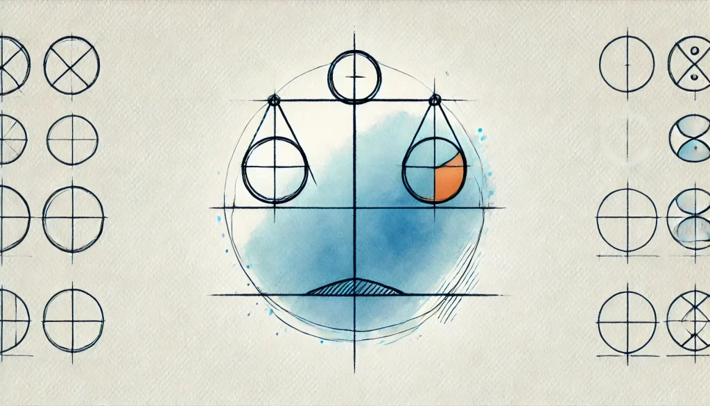
The Balance Between Chaos and Harmony
- Exploring Design Balance Techniques
- Understanding symmetrical and asymmetrical balance
- Balancing visual weight in a composition
Can something be designed without balance? Probably. Should something be designed without balance? Absolutely not. Design Balance Techniques are what keep your designs from tipping over into chaos. They ensure that the visual weight of your design feels evenly distributed—different weights and sizes of various elements, like images or blocks of text, are balanced effectively to create harmony.
Much like a seesaw, you want the elements on opposite sides of the central axis to “feel” even to the eye. There are two classic approaches to achieving this balance: symmetrical and asymmetrical. Symmetrical balances are usually more conservative, offering a sense of calm and traditionalism, while asymmetrical designs can be more dynamic and interesting but risk feeling off-kilter without the right touch. Both require a delicate handling of visual weight, which involves how “heavy” or “light” your design elements feel, their position, and their relationship with surrounding negative space.
You can use symmetry to radiate peace and predictability (think a well-balanced website layout with equal header and footer spaces). Meanwhile, asymmetry carries a modern, forward-thinking vibe that often works for minimalistic designs where empty space plays a key role. Balancing the two approaches can lead to a design that’s both structured and innovative. It’s a dance that designers constantly adjust.
Creating Flow: Visual Rhythm in Graphic Design
- Introduction to Visual Rhythm in Graphic Design
- Exploring different types of rhythm: flowing, progressive, alternating, etc.
- How rhythm impacts user experience and enhances brand identity
What do music and design have in common? Rhythm. Much like a catchy beat can get stuck in your head for days, Visual Rhythm in Graphic Design orchestrates how elements interact repeatedly over a visual layout. Rhythm is essential for crafting the underlying “pace” of a design, guiding viewers effortlessly from one section to the next. It’s less about obvious repetition and more about the sense that everything fits, moves, and behaves in a flowing manner.
There are several types of rhythm patterns in visual design:
- Flowing rhythm: Like waves, guiding the user’s eyes smoothly across the design.
- Progressive rhythm: Each element gradually changes as you scroll or move through the design.
- Alternating rhythm: Think alternating between two design patterns like zigzag banners.
- Regular rhythm: Repeating elements at consistent intervals.
Adding visual rhythm can turn your design into a journey. Flowing rhythms help create harmony and elegance, perfect for high-end brands or websites promoting luxurious or experiential services. Progressive rhythms, on the other hand, are like a dynamic crescendo, often used effectively in future-focused brand campaigns. Alternating rhythm brings energy and contrast, while regular rhythm provides structure and predictability.
In short, rhythm gives design its lifeblood. It doesn’t just dictate how design elements are placed—it creates emotion and keeps your users engaged with subtle or bold movement patterns.
The Power of Understanding Design Hierarchy
- Employing Understanding Design Hierarchy for effective user guidance
- Defining hierarchy through typography, scale, and color
- Common mistakes and solutions in creating poor hierarchy
What screams for attention the second you land on a well-designed website? That’s Understanding Design Hierarchy in action. Hierarchy in graphic design isn’t just about slapping a headline at the top and calling it a day. It’s about showing users—through careful crafting of size, prominence, and placement—what they should focus on, in what order, and how to navigate without even thinking about it.
This principle revolves around three core elements:
- Typography: Bigger headlines on top of smaller body copy instantly highlight what’s important.
- Scale: Larger images or text boxes draw attention faster than small iconography.
- Color: High contrast, bold fonts jump out against muted backgrounds, while smaller, less prominent colors signal less important content.
Without a structured hierarchy, your content feels disorganized. Users strain to find the relevant information, ultimately abandoning your site out of frustration. A well-designed hierarchy is like a GPS for user attention—leading them where they need to go. A great example being news websites using aggressive headers to frequently guide readers through priority topics. By designing clear hierarchies that are scalable, cohesive, and easy to scan, your message stays front and center.
Conclusion
Understanding and applying the Principles of Visual Design—from balance and contrast to hierarchy and rhythm—might seem like splitting hairs at first. But these careful decisions are what set professional designs apart from the rest. The Importance of Contrast in Design goes beyond color visibility. Design Balance Techniques invoke harmony or edge, while Visual Rhythm in Graphic Design can be the magnetic pulse that draws users in. Finally, mastering Understanding Design Hierarchy is perhaps the most critical step in creating intuitive, effective designs that guide users naturally through content.
Always ask yourself: Am I applying these principles? Is the design guiding my user, or are they wandering aimlessly? Adopting these principles will optimize not only how your design looks but also how it performs. Give it a try on your next project, and see the results for yourself!