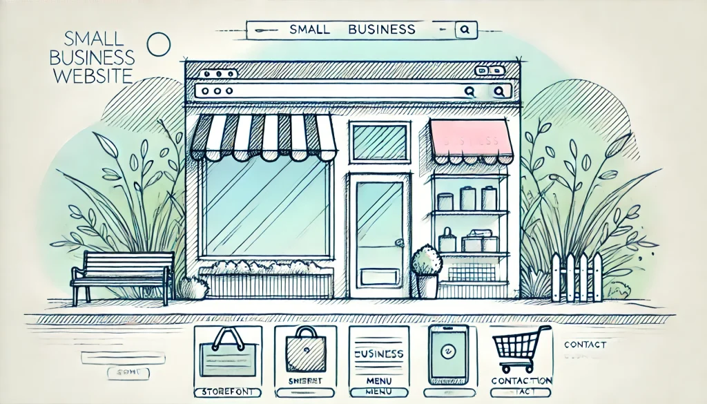
Transform Your Small Business Website Design with These Best Practices
Did you know that 38% of website visitors will stop engaging with a website if the content or layout is unattractive? In today’s fast-paced digital age, first impressions are absolutely crucial for small businesses. Whether it’s a potential lead landing on your homepage or a returning customer checking out new products, a well-designed website can make or break your business. But don’t worry—if you’re a small business owner feeling overwhelmed by the idea of building a great site, you’re not alone.
In this guide, we’ll walk you through some expert small business website design tips that will help you build a website that not only looks good but also functions seamlessly. From mobile website optimization to easy website navigation, we’ve got you covered. Whether you’re looking to increase conversions, build trust, or simply make your business stand out, following these essential practices will set you on the right path. So, let’s dive in!
Reader-Friendly Fonts and Limited Color Schemes
- Select fonts that align with your brand and are easy to read
- Stick to a color scheme that enhances user experience
When it comes to small business website design, readability is essential. While it may be tempting to use creative and fancy fonts, you don’t want to compromise readability just for aesthetics. Choose fonts that reflect your brand but remain legible across all devices, whether it’s a mobile phone or a desktop screen. Tools like Google Fonts and Canva Font Combinations can provide you with plenty of inspiration to make the right choice.
Additionally, color schemes make a massive difference in how customers perceive your site. According to research from Loyola University, color improves brand recognition by up to 80%! Limit your palette to two to three main colors, and ensure they are harmonious. Too many colors can confuse and overwhelm visitors, while a well-curated scheme will guide their attention toward key content.
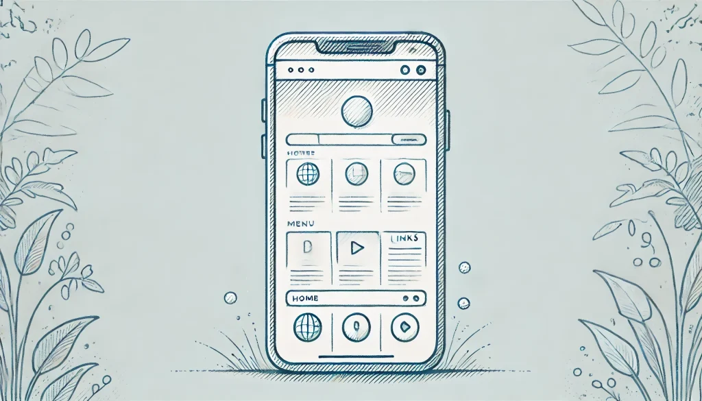
Mobile Website Optimization: A Must-Do
- Ensure your site is responsive on different devices
- Large clickable buttons and easy-to-read text are a must for tiny screens
In 2023, mobile website optimization is no longer optional—it’s a vital part of any small business website design. With over 7.1 billion mobile users around the world, a site that isn’t optimized for mobile could be driving away half of your potential traffic. To make sure your site works well across all devices, use responsive design templates. This allows your site layout to adapt seamlessly to different screen sizes without compromising functionality.
Another great tip for mobile website optimization is to use large, easy-to-tap buttons. It can be incredibly frustrating for users when the clickable areas on your site are too small, leading to accidental clicks or confusion. Keep text sizes appropriate for mobile screens as well, so that no one has to squint to read about your amazing products or services.
High-Quality Website Images: First Impressions Matter
- Use images that captivate and engage your audience
- Keep image file sizes optimized to avoid slow loading times
They say a picture is worth a thousand words, and this is particularly true when it comes to your website. High-quality website images can captivate your visitors and make a strong first impression. Since your audience can’t touch or try your products online, compelling visuals can help fill that sensory gap and make your offerings stand out.
However, quality comes with a cost: slow loading times, if not optimized properly! Save your images in appropriate formats like JPEG or PNG and compress them to ensure they don’t take forever to load—nobody likes a slow website. But don’t sacrifice resolution too much; balance is key. Properly optimized, high-quality website images can significantly impact how professional and trustworthy your site appears.
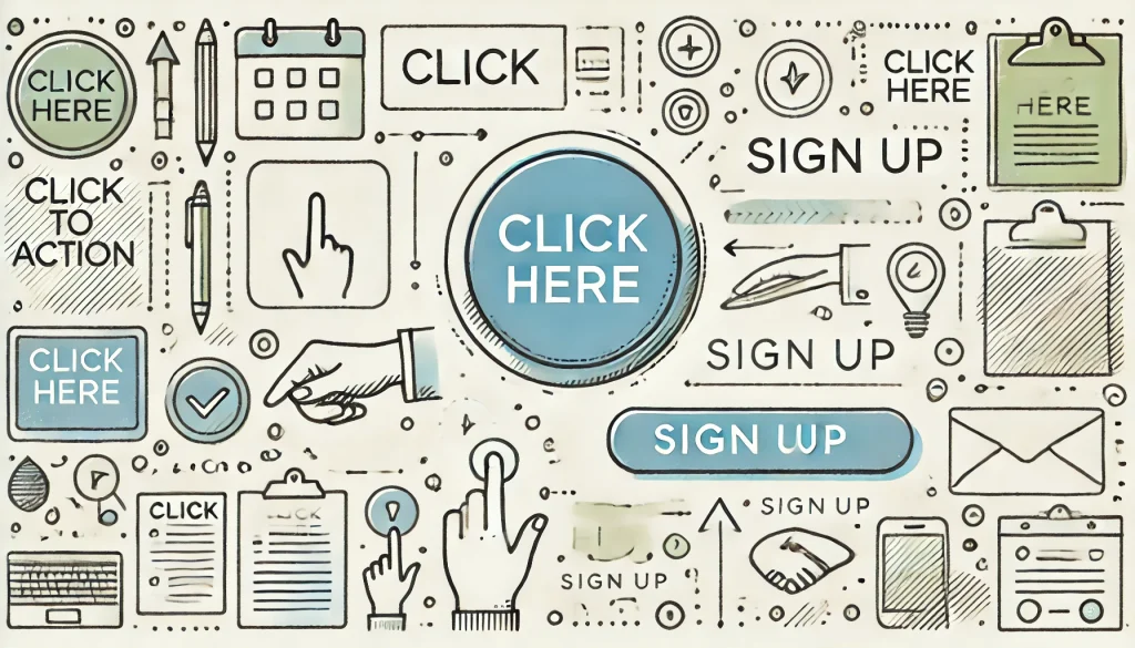
Effective Call to Action (CTA): Drive Your Visitors to Take Action
- Ensure your CTA speaks to your audience’s needs
- Experiment with placement for higher conversion rates
A call to action (CTA) is one of the most critical elements on your website. Whether you want users to buy a product, subscribe to your newsletter, or fill out a contact form, your CTA must be clear, compelling, and easy to find. Most importantly, your CTA should address your audience’s desires—what value do they get by clicking that button?
Don’t be afraid to experiment with different placements for your CTAs. Sometimes moving a button from the top of the page to the middle or bottom can result in higher clicks. You can also make your CTAs more engaging by using dynamic language that creates a sense of urgency, such as “Shop Now!” or “Get My Free Quote.” Ultimately, an effective call to action can help guide visitors toward making a purchase or performing the desired action on your site.
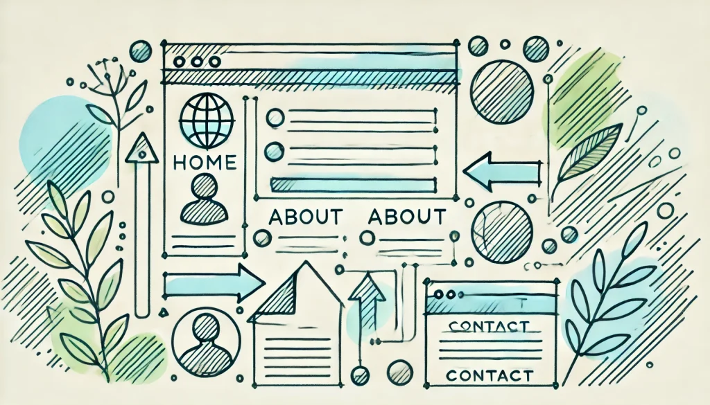
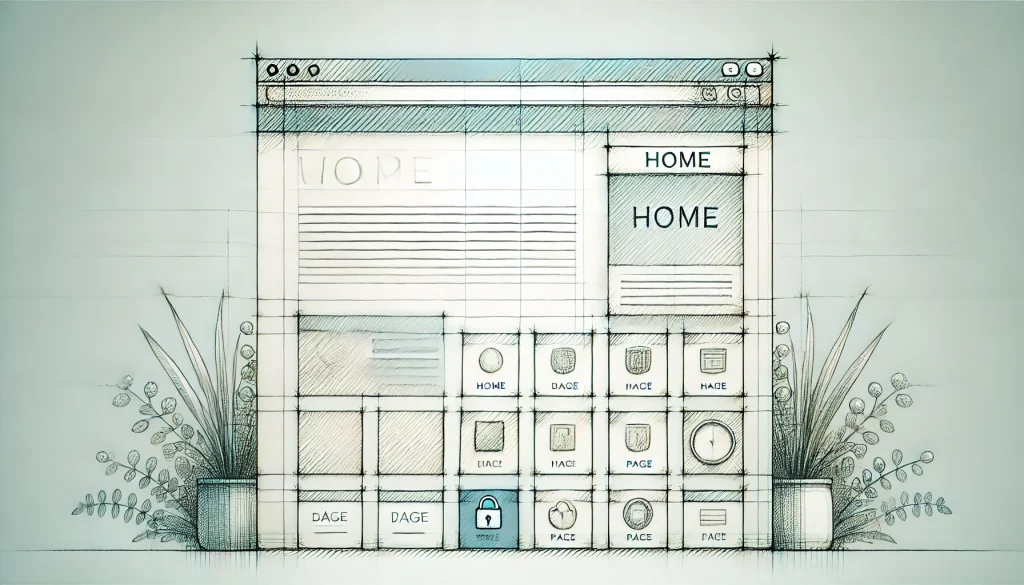
Easy Website Navigation: Make It Frictionless
- Keep navigation menus simple and intuitive
- Ensure all important pages are no more than two clicks away
If users have to hunt for the information they need on your website, they’re likely to leave in frustration. That’s why easy website navigation is crucial for a positive user experience. Your site should allow both first-time visitors and returning customers to easily find what they’re looking for, quickly and without fuss.
A great way to ensure this is by placing a simple and clear navigation menu at the top of the page. Stick to a few core categories that are relevant to your business, and provide intuitive sub-menu options if necessary. A good rule of thumb is that important pages (like “Contact” or “Shop”) should only be two clicks away from the homepage. This creates a smooth, frictionless experience for users and increases the likelihood of conversion.
Clean Layout with Minimal Clutter
- Use white space to highlight key content areas
- Avoid overwhelming users with unnecessary elements
Clutter kills clarity. If your website is overloaded with images, text, buttons, and flashy animations, visitors will quickly lose focus and bounce away. White space— the empty areas between design elements—is essential for ensuring your content remains digestible and pleasing to the eye.
When designing your pages, focus on the essentials and get rid of anything that doesn’t contribute to the user’s journey. A simpler layout helps direct attention to key content areas, such as your effective call to action, product descriptions, or videos, making the overall experience less stressful and more engaging. The less visual noise you have, the easier it is for people to focus on what matters.

Testimonials and Social Proof: Build Trust with Your Audience
- Include reviews and testimonials to establish credibility
- Feature user-generated content to showcase real-world usage
Word-of-mouth is still one of the strongest forms of advertising, and the digital equivalent is online reviews and testimonials. Including feedback from satisfied customers helps establish trust and credibility, which is especially important for small businesses just starting out. According to BigCommerce, 92% of consumers review testimonials before making a purchase.
Displaying testimonials prominently on your small business website design can significantly amplify your conversions. You can further build credibility by showcasing user-generated photos and videos, giving prospects a real-world idea of what they can expect. Leveraging existing customers as brand advocates is a great way to build trust and encourage new visitors to take action.
Conclusion
Designing an effective small business website requires not just a good eye for aesthetics, but also a focus on functionality and user experience. From optimizing your site for mobile to ensuring it’s clutter-free and easy to navigate, there are endless possibilities for creating a website that speaks to your audience. We’ve covered crucial topics like the importance of high-quality website images, the power of an effective call to action, and the backbone of your site—easy website navigation.
As a small business owner, your website is your digital storefront, and it’s absolutely essential to get it right. Ready to take the next step? Dive into your website overhaul by applying these best practices, and don’t forget to test what works for your specific audience. With the right upgrades, your site can turn into a powerful tool of conversion, engagement, and growth!