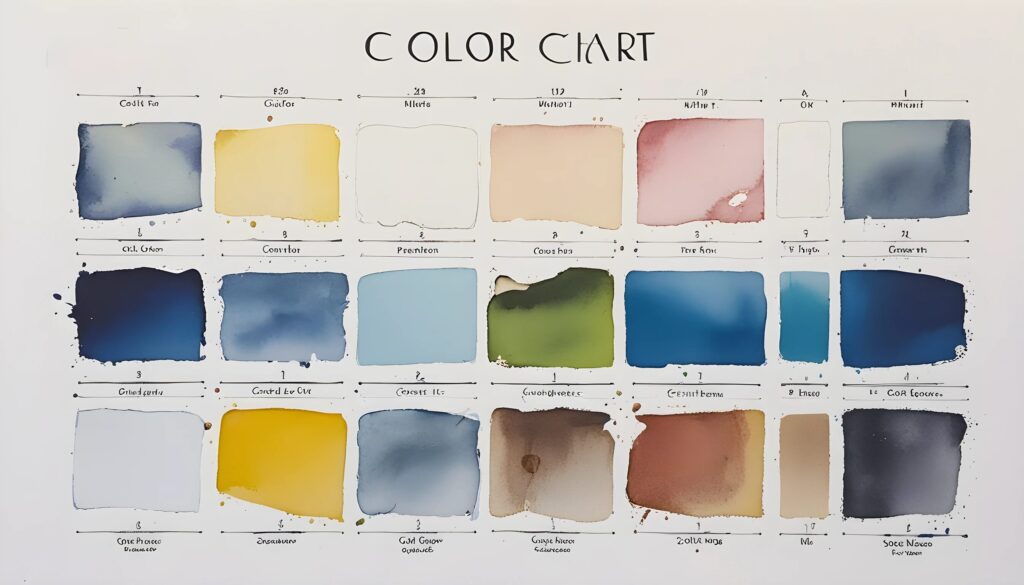
The Secret Language of Colors: What Your Favorite Shade Says About You
Picture this: you walk into a café, and the walls are painted a soothing pastel blue. Instantly, you feel calmer, maybe even a little more productive. Now, imagine that same café drenched in bright red. Suddenly, it’s less “relaxing coffee break” and more “high-stakes energy drink commercial.” Coincidence? Absolutely not. The effects of colors on mood are backed by science, psychology, and a little bit of marketing magic. Understanding color emotions isn’t just about picking the right shade of lipstick—it’s about tapping into a hidden language that influences everything from shopping decisions to workplace productivity.
How Color Psychology Shapes Our Emotions
- Colors trigger specific psychological responses, often without us realizing it.
- Warm colors stimulate energy and excitement, while cool colors promote relaxation.
- Color perception is influenced by personal experiences and cultural backgrounds.
Ever noticed how fast-food chains love using red and yellow? That’s because red increases heart rate and hunger, while yellow creates a sense of urgency—perfect for making you order that extra-large fries. Meanwhile, spas and hospitals lean heavily on blues and greens because they promote calmness and trust. But color interpretations aren’t universal—white symbolizes purity in some cultures and mourning in others. So before you paint your living room bright orange thinking it’ll enhance creativity, remember: context (and a little common sense) matters.
Decoding the Meanings Behind Popular Colors
- Red: Passion, power, urgency, and appetite stimulation.
- Orange: Energy, enthusiasm, and affordability.
- Yellow: Optimism, intellect, and caution.
- Green: Growth, balance, stability, and wealth.
- Blue: Trust, serenity, productivity, and professionalism.
- Purple: Creativity, luxury, spirituality, and mystery.
Every color tells a story, and if you’re not careful, you might be telling the wrong one. Red isn’t just for love letters—it also screams “SALE!” at every retail store. Orange is playful and energetic, but overdo it, and your brand might end up looking like a Halloween decoration. Yellow is cheerful but can also be overwhelming in large doses (ever tried staring at a bright yellow wall for too long?). Green screams eco-friendly and financial success, while blue is perfect for building trust—no wonder banks and social media platforms gravitate toward it. And then there’s purple, the eternal favorite of luxury brands and people who think wearing it makes them look “deep.” (Spoiler: it doesn’t always work.)
Color Theory in Marketing: Why Brands Obsess Over the Right Shade
- Companies use color strategically to influence consumer behavior.
- Different industries rely on specific colors to evoke trust and engagement.
- A well-chosen brand color can boost recognition and consumer loyalty.
Why does Facebook bathe itself in blue? Because blue fosters trust and dependability—exactly what you want when convincing people to share their lives online. Meanwhile, McDonald’s and KFC rely on red and yellow to make your stomach growl on command. Luxury brands like Chanel prefer black because nothing says “expensive” quite like a sleek, monochromatic logo. Even Amazon plays the color game well—its use of orange suggests affordability with a side of excitement. The bottom line? Color theory in marketing is a multi-billion-dollar industry, and whether you realize it or not, it’s working on you.
Using Color Psychology to Improve Your Life
- Pick colors strategically to enhance mood and productivity.
- Dress in colors that convey confidence and authority.
- Incorporate color into home decor to create the desired ambiance.
Need to nail that job interview? Wear navy blue—it exudes professionalism and reliability. Want to appear more approachable? A splash of orange can make you seem warm and friendly. Struggling with focus? Surround yourself with green, the color of balance and concentration. And if you’re aiming for a more creative workspace, purple accents might just give your imagination the boost it needs. The right color choices don’t just make you look good—they can make you feel unstoppable.
Final Thoughts: Mastering the Art of Color Psychology
Color isn’t just decoration—it’s communication. It influences our emotions, decisions, and even our perception of brands and people. Whether you’re choosing an outfit, redecorating your home, or building a business, understanding color emotions can give you a strategic advantage. So, the next time you find yourself drawn to a particular shade, ask yourself: is it really your favorite color—or did marketing experts plant that idea in your head? Either way, choose wisely. Your color choices might just be saying more about you than you think.
